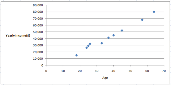
In the previous lecture on scatter plots, we made a scatter plot for some sample bivariate data and concluded that the two variables were probably related.
|
Figure 1. |
|---|
We can use this data to calculate Pearson's r
| Pearson’s r |
|---|
|
Pearson’s r measures the strength of the linear relationship between two variables. Pearson’s r is always between -1 and 1. |
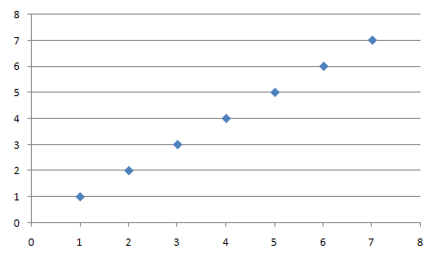
Here is a perfect positive relationship. r is equal to 1.0:
|
Figure 2. |
|---|
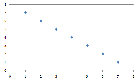
Here is a perfect negative relationship. r is equal to -1.0:
|
Figure 3. |
|---|
Here is an example of data that has no relationship. r is somewhere close to 0.0:

|
Figure 4. |
|---|
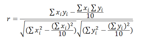
Pearson's r is calculated with the following equation:
|
Figure 5. |
|---|
Plugging in the values from our original example with ages and yearly incomes, we can calculate the following r:
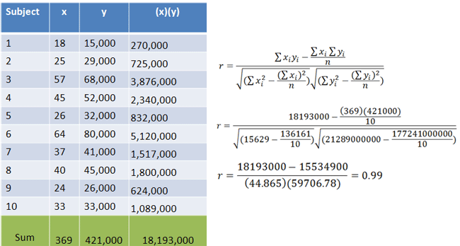
|
Figure 6. |
|---|
This r is almost 1.0, so we can conclude that x(Age) and y(Yearly Income) have a strong positive relationship. As one increases, the other tends to increase as well.


 Facebook
 YouTube


 Home
Home
 Calculators
 Tutoring